A personal account by Dr Conor Walsh, Environmental Scientist at NRI
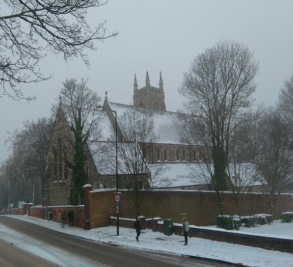 Like many people, I was affected by the heavy snow that fell in Medway in Kent, UK, last February. As I was trying and failing to cycle home in the snow, I stopped to take this picture of a church (to the right). As I was admiring it (and shivering) I was tempted to say to myself, “Bah, climate change! What climate change?! It’s freezing!”
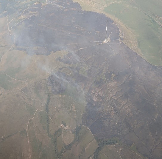 Sadly, this view isn’t really justifiable as it is based on our difficulty to recognise longer term change, as we go about our day-to-day lives. Weather is generally what we experience on a daily basis, and (especially in the UK) can vary a lot over a short period, i.e. rainy today, sunny tomorrow. Climate, on the other hand, is the longer-term trends in the weather systems across the globe. A few months after experiencing heavy snow, the UK had one of its hottest summers in several decades. The other picture was taken by a passenger on a plane flying over the North of England, where the dry and hot weather contributed to the spread of hill fires, resulting in a massive release of carbon dioxide and smoke, which was a big concern for asthma sufferers. Snow and fire, what a strange year!
Trying to make sense of change is what the new Master’s course ‘Global Environmental Change’ at the Natural Resources Institute, University of Greenwich, is all about. Change occurs across time and space and so can be difficult to see what the most important messages are.
This course looks at what changes to our environment could mean for us, on a global level, both in the past and in the future. We hope this will help make sense of the changes we see day to day. So, for example, we cannot say that a particular cold or warm month is due to climate change, but we can – by examining past trends – calculate the probability of experiencing these recent unusual weather patterns.
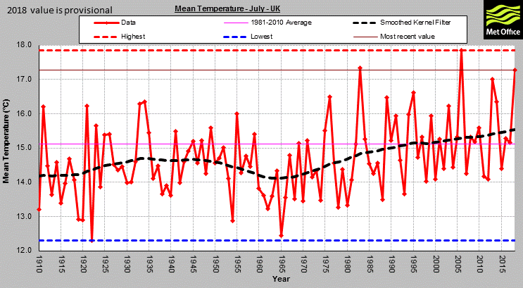
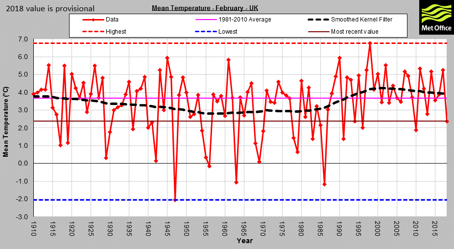
Similarly, we talk about how likely it is that such extreme weather will return in the future. Returning to our recent hot summer, data from the Met Office (the third picture) shows us how average temperatures in July have changed over the past century. We see how temperatures change year on year, but the most recent average temperature record for July – the solid brown line in the first graph – is hotter than almost every July on record since 1910! Looking at February (the final picture) we see that even though the most recent average temperature is colder than many records over the past century (again look at the solid brown line), the general trend we can see in the black dashed line is increasing temperatures since the mid-1970s. How to make sense of the changes we see in environmental data is one of the core elements we will explore over the coming term.
So, remember the next time you’re cycling uphill in the snow, just because your teeth are chattering doesn’t mean that climate change isn’t real!
Apply to the Global Environmental Change MSc | Dr Walsh's profile | Study with us at NRI


